

Capitalization Bubble
You get what you pay for.

In today’s article, we compile our own index and examine valuation ratios for the market, with a special interest in how these ratios relate to the market capitalization of a company.
Smokescreen
Needless to say, equity markets have been difficult to analyze in recent years. Many professionals, even industry veterans, have been caught red-handed making poor calls and are chastised for it. This only reinforces the mainstream opinion that there is, indeed, nothing to worry about in the stock market.
As investors, our job is not necessarily to worry (an emotional state) but to manage risk (a logical activity). Where is the risk in the market? How can we avoid that risk? These are the questions that we grapple with.
One way to think about risk is paying for something that will not be worth that much in the future.
Sales Multiple
Revenue is the lifeblood of a company. Without revenue, you could not get any income! Revenue may not be the best way to analyze a company, depending on its sector and expected margins, but it is one of the most basic valuation ratios we may consider.
There is a wonderful website called CompaniesMarketcap.com that offers financial information for company market capitalization, revenue, income, total assets, total liabilities, debt, cash on hand, etc., all the way back to 2001. For instance, here is the market capitalization history of Microsoft, currently the largest U.S. company.
Before we begin analyzing the numbers, we will scrape variables for the largest 500 U.S. companies from the above website. Our index has the same principle as the S&P 500, but the companies included may not be the exact same. Once we have all the information, we can aggregate, say, revenue by year for the entire index. How we aggregate our variables makes a big difference.
To begin, we will weigh revenue by the market capitalization of the company while aggregating. This is the method that most financial series use. Companies without complete data will be removed. After we have done this, we can render the chart below.
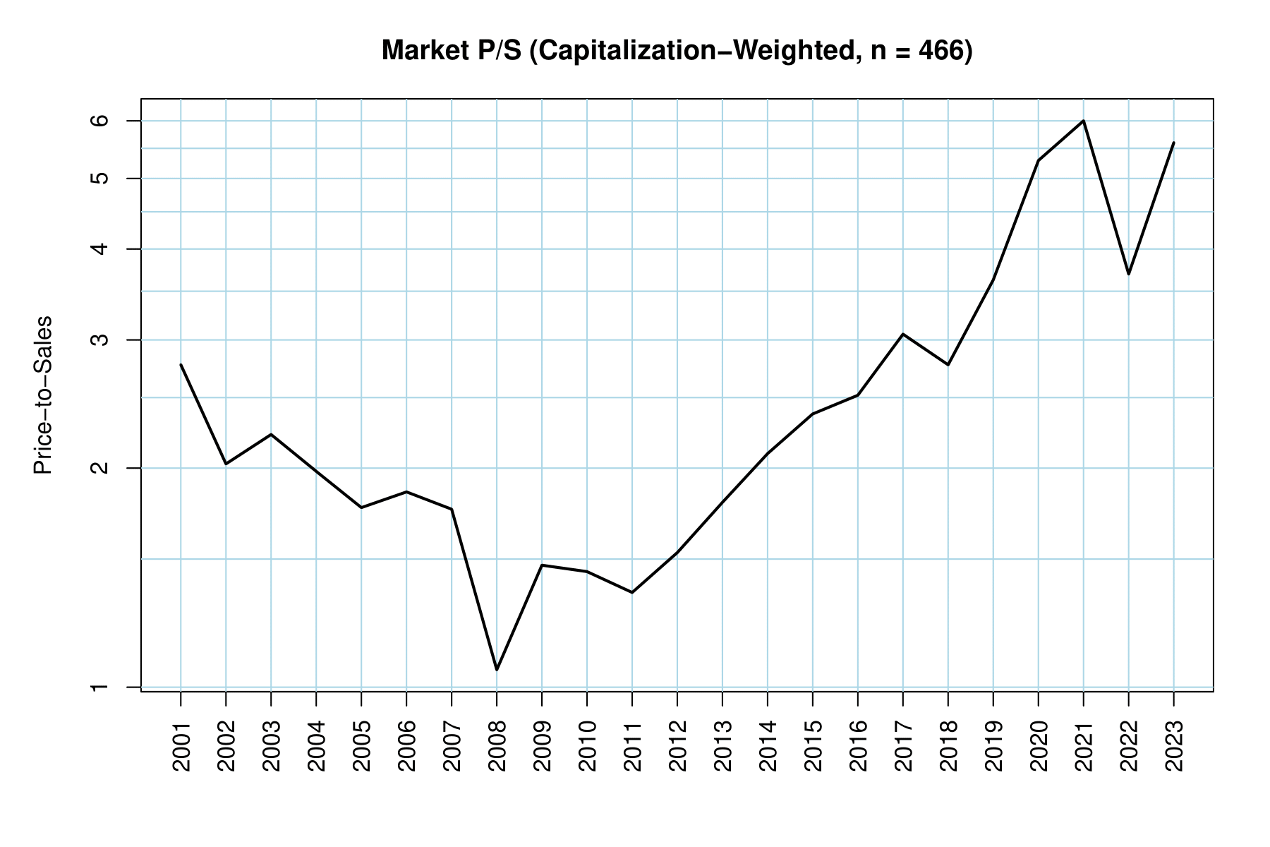
As seen in the chart above, our sales multiple ranges between one and six, meaning that, depending on the year, it could take anywhere between one year of revenue to six years of revenue to “pay for” the capitalization of the stock. This is, of course, an imperfect metric because it is impossible for all the revenue to be funneled back to investors! We will address this in the below section with an earnings multiple approach.
Besides weighing the stocks by their capitalization, what if we considered each stock to be the same weight as every other? This is called an equal-weighted approach and is represented in the chart below.
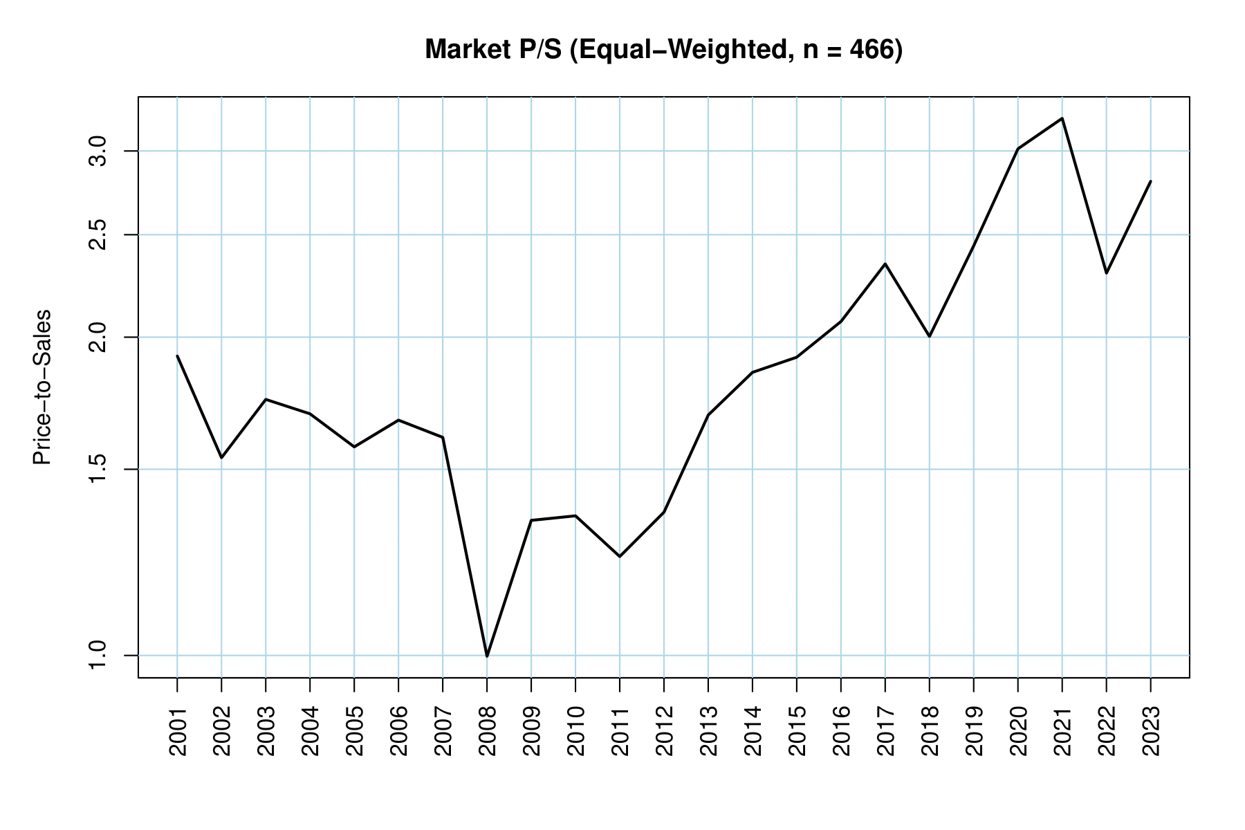
Notice that our sales multiple has a smaller range, from one to a little over three. How this differs from the above is crucial. It means that the “typical” stock has a cheaper sales multiple than large stocks. Sometimes large stocks deserve to be more expensive because they are higher-quality or more efficient companies. Sometimes those large stocks are eventually seen as overvalued, which is what happened to the “Nifty Fifty” blue chips of the 1960s and 1970s.
To better parse out the difference between the weighing methods above, we can simply take their spread (quotient). We will compare the cap-weighted sales multiples over the equal-weighted sales multiples in the chart below.
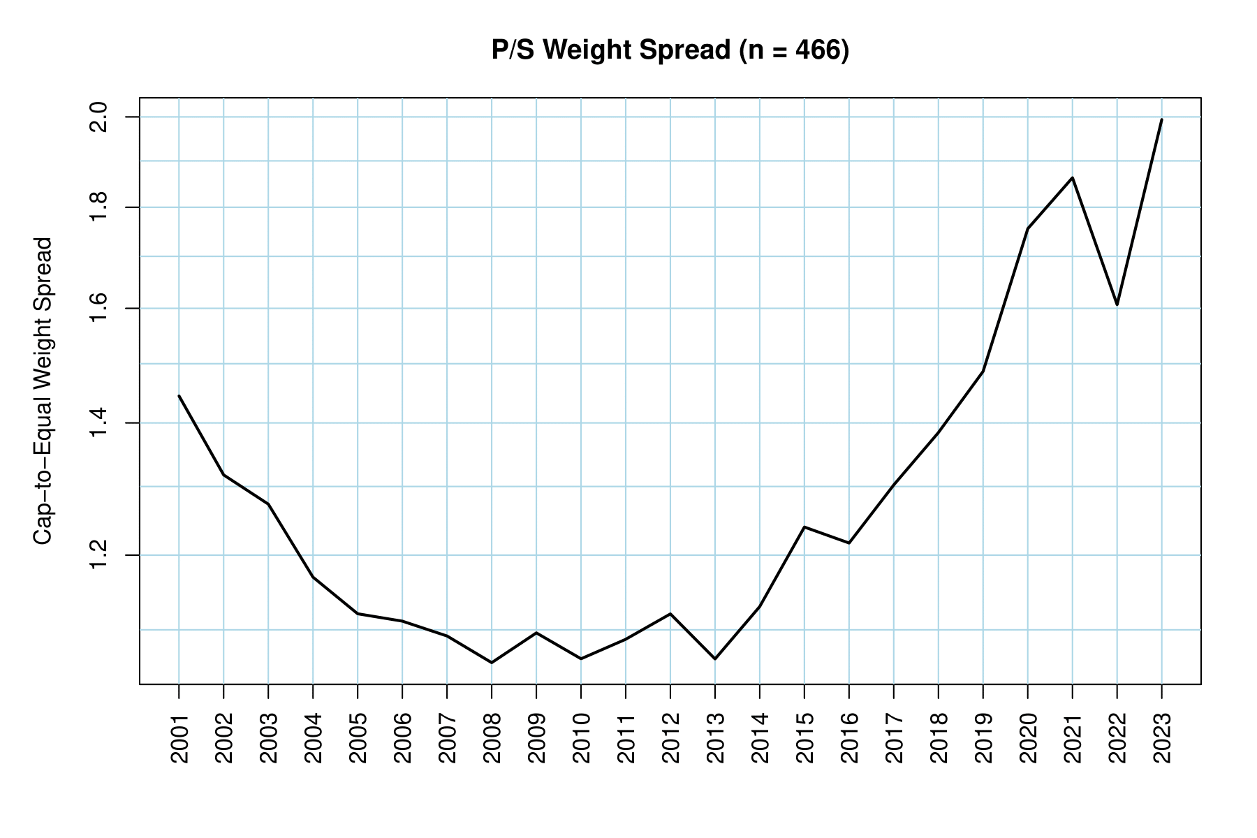
This makes it abundantly clear that mega-cap and large-cap stocks are becoming more expensive at an accelerated pace compared to the “typical” stock. In fact, the sales multiple for the cap-weighted ratio has outpaced the equal-weighted ratio by about 82% between 2009 and 2023. Remember, this is an outpacing. It could be that the equal-weighted ratio is already expensive, but the cap-weighted ratio is that much more expensive!
If we take a step back and just consider the cap-weighted sales multiple, we can see that it is roughly 550% more expensive today than it was at the end of 2008. The valuations at the depths of the Great Financial Crisis (GFC) were, of course, a rarity, but the fact remains that this market is much more expensive.
Earnings Multiple
To make the analysis more realistic than simple revenue, we can look at earnings. The net income a company produces actually goes into the value of the stock, so an earnings multiple (commonly known as the P/E ratio) is more accurate than a sales multiple. Let us take a look at the charts below, similar to the ones in the previous section, to see if there is any improvement in market valuation.
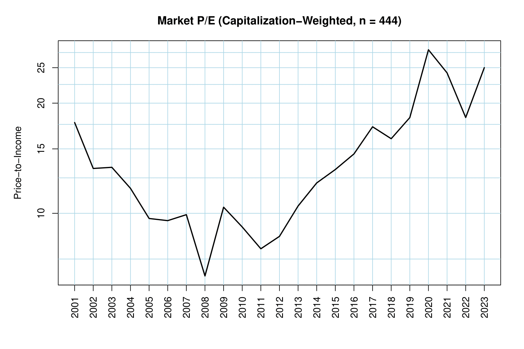
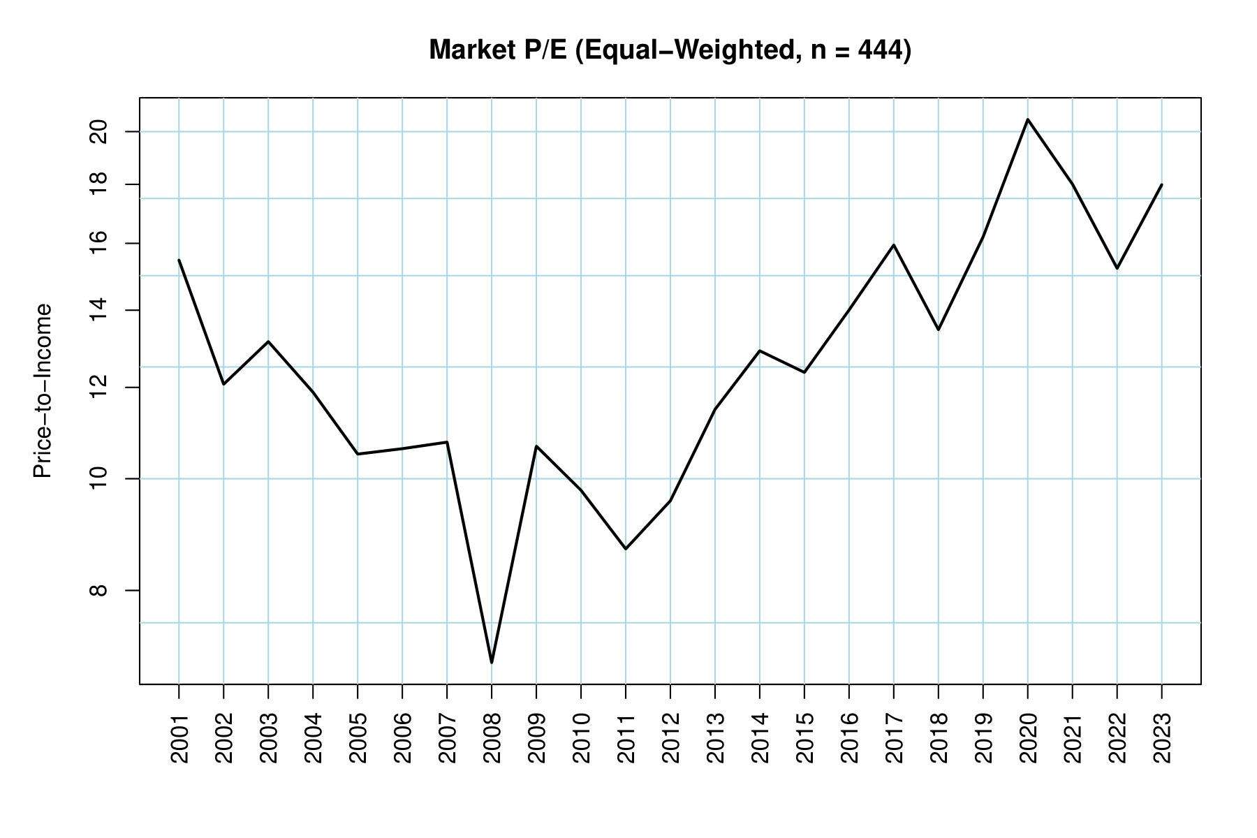
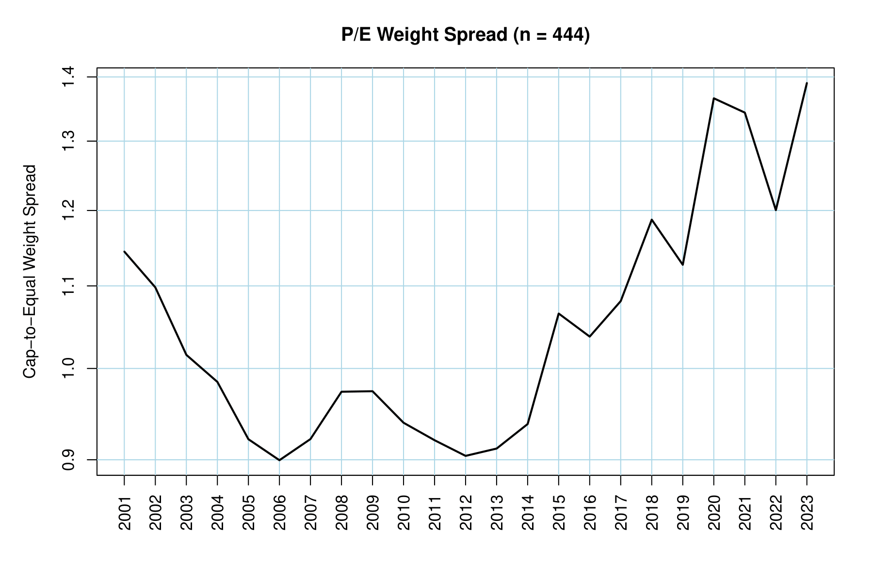
The picture is slightly better. There has “only” been a 43% outperformance of the cap-weighted P/E ratio over the equal-weighted P/E ratio. Still, the earnings multiple for the cap-weighted series is about 250% more expensive today than in 2009. What makes this different from the sales multiple is margins! A lot of the largest companies today are in the technology sector, which tends to convert revenue to income more efficiently than other sectors.
Let us continue the analysis with a couple more valuation ratios.
Equity Multiple
Equity, or book value, is defined as total assets less total liabilities. If equity is a positive number, it means the company owns more than they owe, roughly speaking. Where it fails, in my opinion, is over-reliance on intangible assets and “goodwill.” Since these assets are not real, they can be subject to public opinion. Nevertheless, we can examine the market equity multiple below.
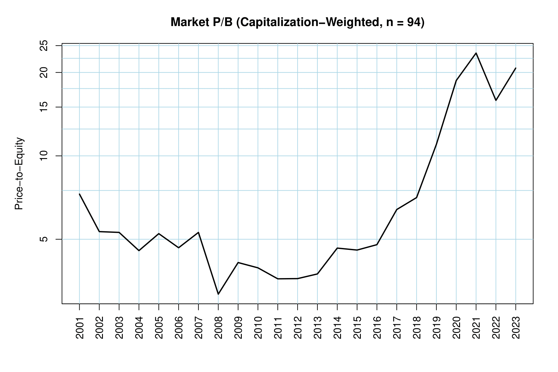
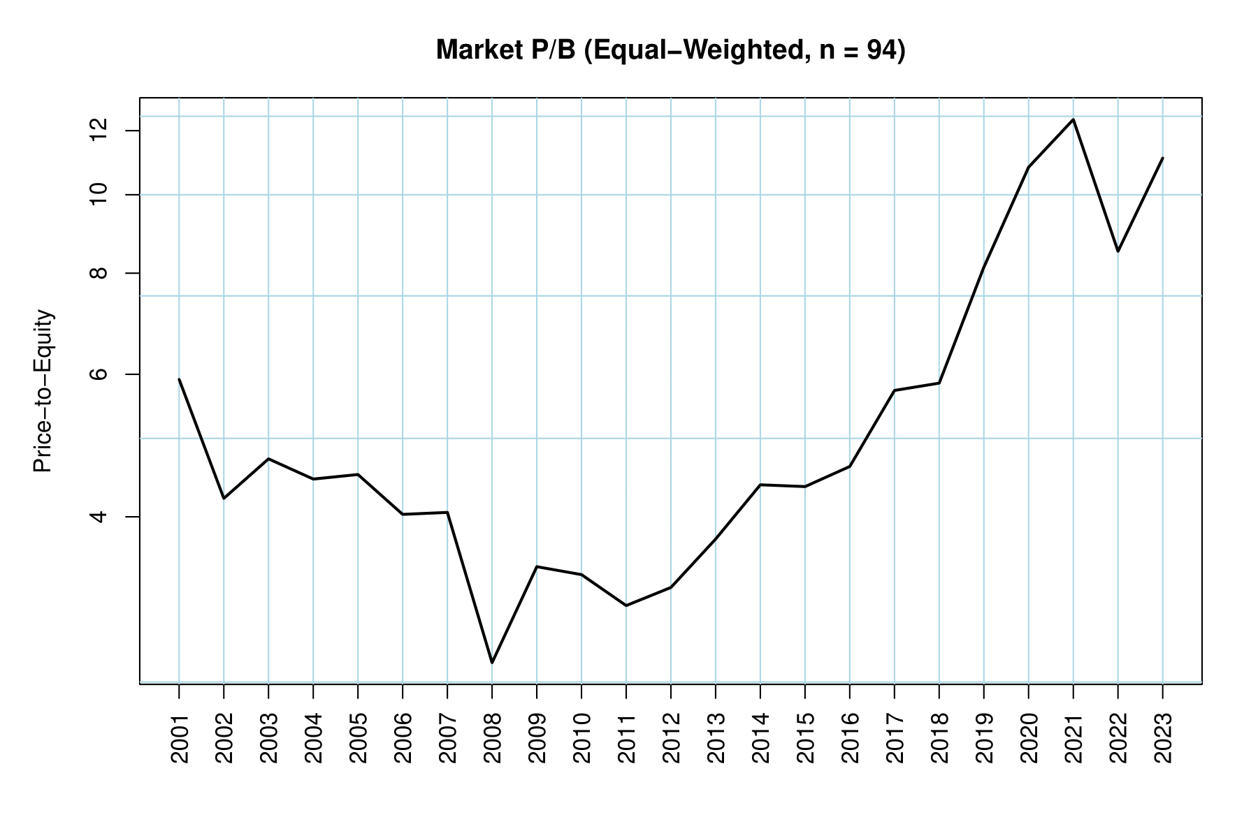
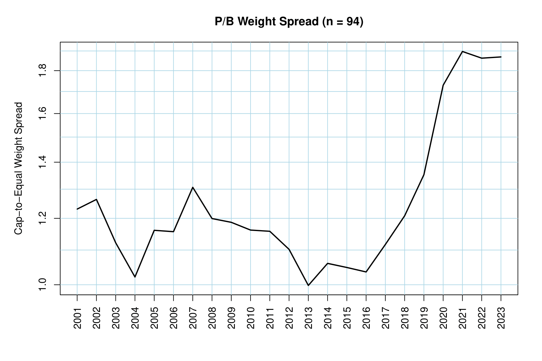
Do note that we have much less data for this ratio. Only 94 of the 500 companies we scraped have complete data from 2001 to 2023. While this number is still large enough to be considered an acceptable sample, we could be leaving out mega-caps that have a bigger effect on the ratio.
Investing based on book value is certainly more “old school” than how most managers operate today, but it is still important to consider in the rare event the company you invested in faces bankruptcy.
There has been about an 81% outperformance in the cap-weighted P/B ratio over the equal-weighted P/B ratio from 2016 to 2023. The cap-weighted P/B ratio is roughly 700% more expensive today than in 2011. Your investment is not getting much in the way of net assets, and this is barring the fact that most of those assets may not be real!
Hang in there, we only have one last valuation ratio to look at.
Debt to Equity
This ratio is especially pertinent to recent changes in the bond market. Unlike the majority of the past 15 years, debt now costs something. We can compare a company’s debt to its equity to find out how leveraged they are. The more leverage, the more sensitive they will be to increased interest rates or declining income.
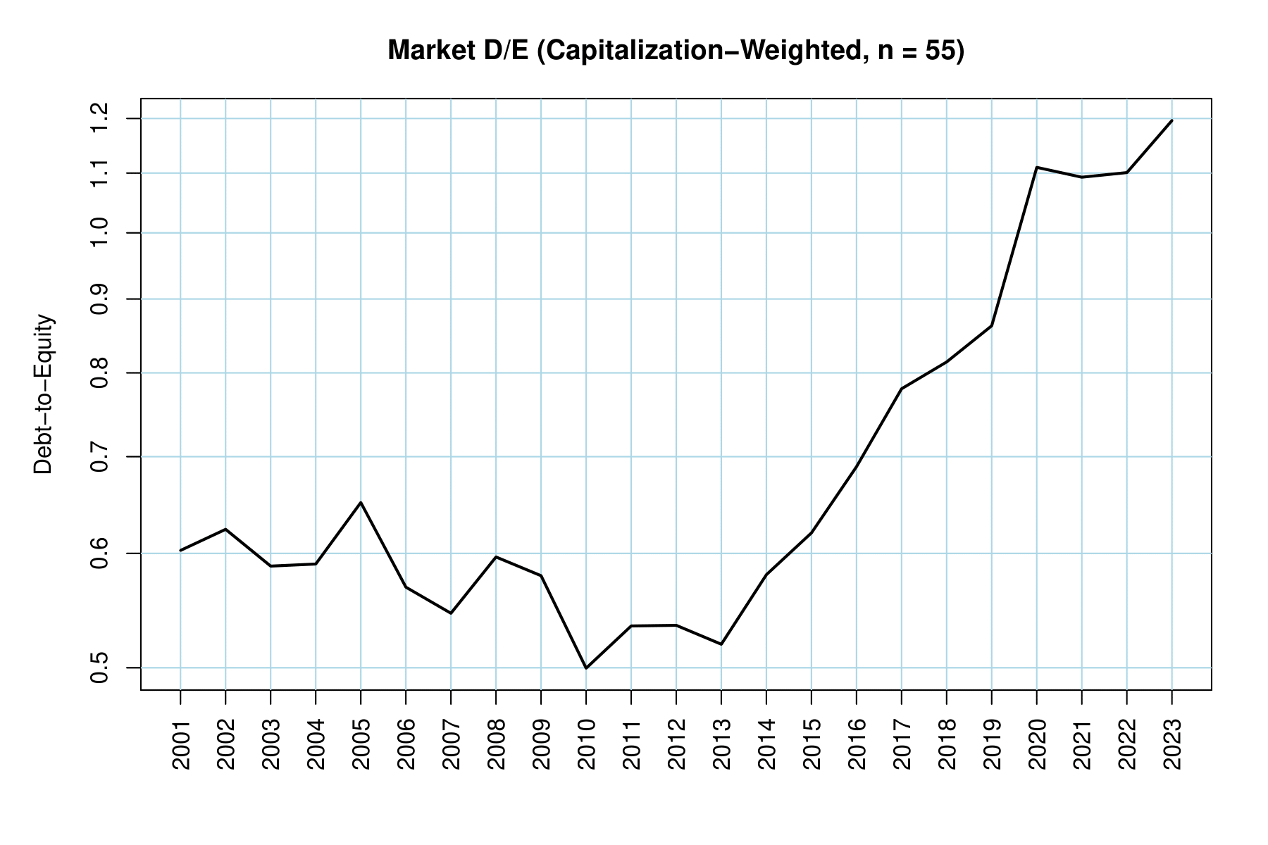
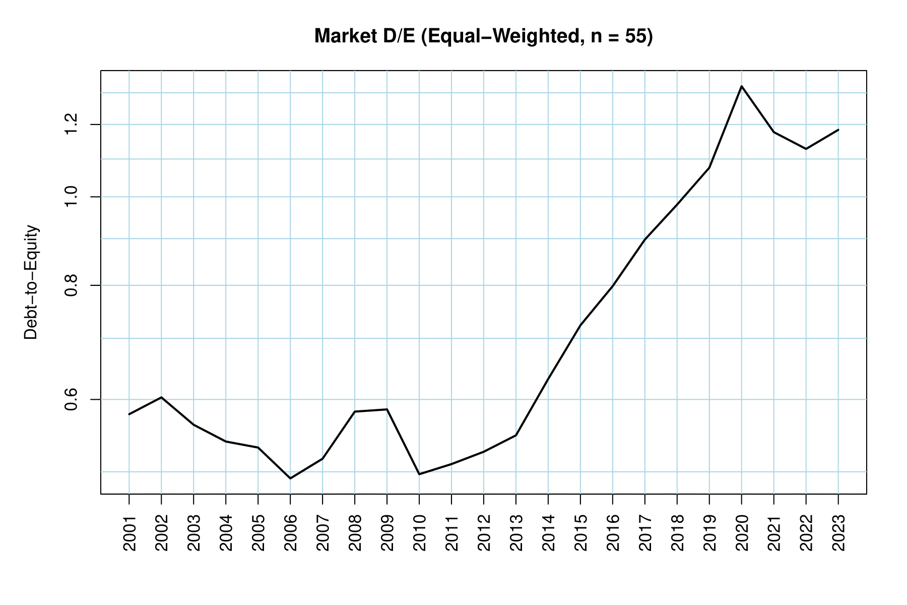
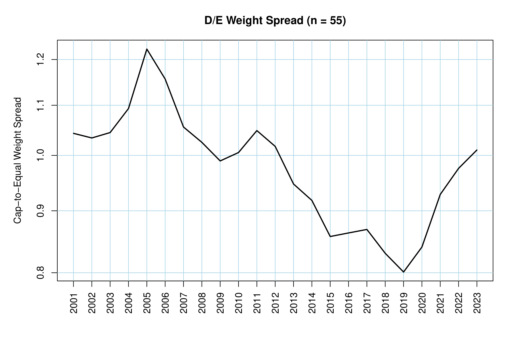
Even worse than the P/B ratio, we now only have 55 companies with complete data. We should now be getting more skeptical about the accuracy of these numbers but can proceed carefully.
The market has become drastically more levered since about 2010, and this time all companies are to blame! No matter how this ratio is weighted, it has increased by about 240% since 2010. Notice that there has not been much, if any, deleveraging since interest rates increased in 2022. As corporate debt matures, this will lead to increased expenses for many companies. If those companies have small margins or few assets to service that added cost, they may begin to fail.
Tread Carefully
It appears the market is playing a game of chicken. Build the bubble until someone sells. Perhaps the only difference we can look forward to is whether sellers will file out in an orderly fashion or stampede and crush each other on the way out.
By all means, you can disagree with me and think that this market is fairly valued. There is no way I can stop you from buying.
You get what you pay for.