

Five Reasons to Be Cautious
Examining our crowded, expensive market.

In today's issue, we comb over an array of charts from a mile-high view of market history to discover that we are, indeed, extended.
Preface
While difficult, it is possible to be both bearish in the long run and bullish in the short term. The momentum that exists in the market at present will most likely continue for some time. However, that does not mean the outlook is necessarily rosy if we plan on investing for the next decade.
As we investigate the following charts, it is important to remember to think in terms of years, if not decades. This is easier said than done in the age of short attention spans!
Finally, pay close attention to how the market would be considered to have great value around the years 1942, 1982, and 2009. Conversely, the market reached levels of great excess in 1929, 1966, 2000, and arguably now.
32.6 Years
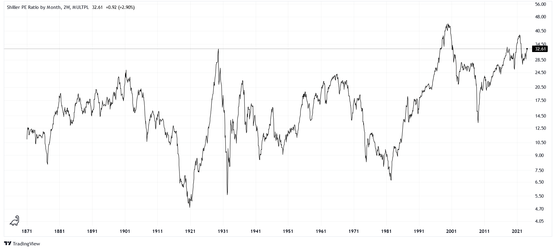
Robert Shiller is a highly influential American economist. One of his most famous series, the cyclically-adjusted P/E ratio (CAPE), normalizes the P/E ratio of the S&P 500 index for inflation over 10-year periods. Its current value reads 32.6, meaning that the capitalization (price) of the market is 32.6 times larger than its total earnings (net income). One way to rationalize this value is to consider that it would take 32.6 years of earnings to "pay off" the current capitalization.
Another way to think of this value is to invert the number into an "earnings yield," which comes out to 3.07%. The income stream you are buying into is theoretically delivering 3.07% back to you each year. It is crucial to compare this to the U.S. Treasury 10-year constant maturity rate of 4.24%. Treasury bonds are highly liquid, carry virtually no risk of default, and are guaranteed to pay you principal plus interest if held to maturity. Therefore, the asset that carries no risk of permanent loss of capital is paying you *more* than equities, an explicit risk asset.
Why would you want to be paid less to take on more risk?
2.46 Ounces of Gold
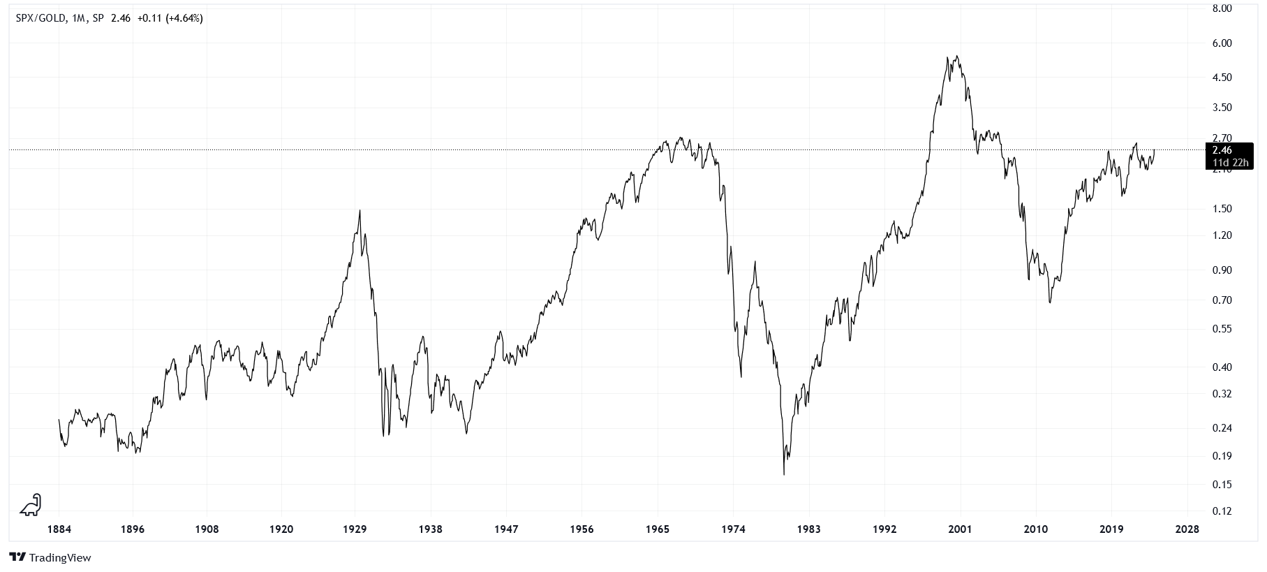
If we take the spread of the S&P 500 cash index (SPX) and the price of an ounce of gold, we are no longer pricing the market in dollars but in ounces of gold. It is important to note that the price of gold was fixed in the United States before the 1970s, hence the dramatic plunge in our spread around that period.
Only at the end of the 1960s (famous for a basket of expensive blue-chip stocks dubbed the Nifty Fifty) and the Dotcom bubble (which peaked around the new millennium) do we see equities being more expensive than today, relative to gold.
Do you see more upside or more downside on this chart?
Equities are Popular
When everybody is doing it, being the last to join in usually does not go well.
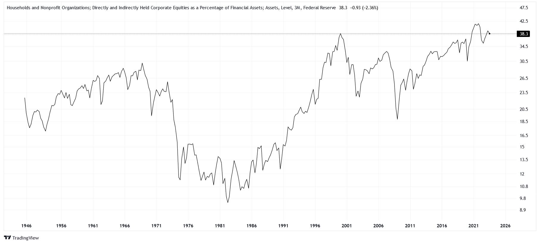
The variable we are looking at is something of a unicorn. Provided by the Federal Reserve, its full title is "Households and Nonprofit Organizations; Directly and Indirectly Held Corporate Equities as a Percentage of Financial Assets." Currently, this measure tells us that for all the financial assets that households and nonprofits hold, 38.3% of their value comes from equities. Besides 2021, the only time we had a similar reading was during the Dotcom bubble.
We may reason that stocks are becoming more popular as younger generations learn little about the bond market, but we would be foolish to ignore how low this measure has been in the past. In 1982, equities accounted for less than 10% of household financial assets, presumably because of alternatives such as high-yield bonds and a tremendous run in the price of gold.
Households are Happy
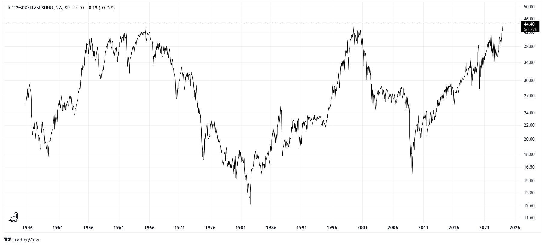
Investigating a similar area to the one above, we can take the spread of the SPX and a variable titled "Households and Nonprofit Organizations; Total Financial Assets." This ratio allows us to compare the price of the market to the total capitalization of household financial assets.
Once again, we are quite extended, surpassing the levels of 1966 and 2000.
Corporations are Happy
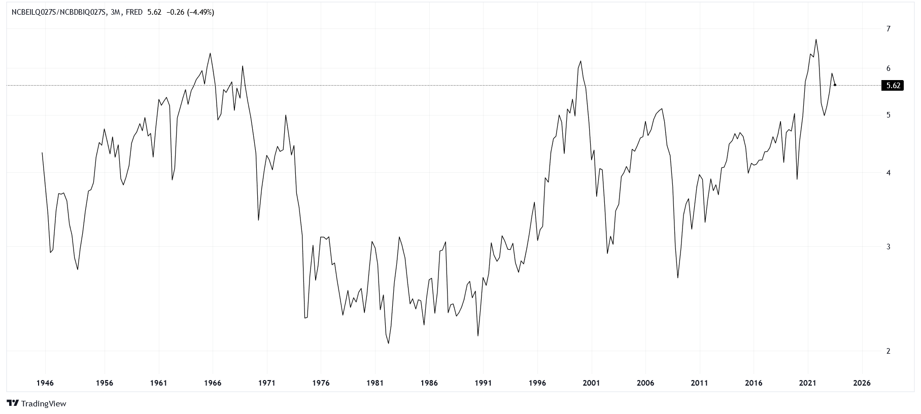
Finally, we can run a similar spread for corporations. We will take the ratio between "Nonfinancial Corporate Business; Corporate Equities" and "Nonfinancial Corporate Business; Debt Securities." Currently, even businesses can feel cozy looking at their stock portfolios!
Conclusion
Scanning the above charts, the patterns of history are surprisingly consistent beyond the idiosyncrasies of each variable set.
A possible game plan for the coming decade arises when we understand the 1960s and 2000s. Despite the market being expensive in each of these decades, they provided ample opportunities to trade cyclically. Buy the crashes, sell the tops.
Better yet, for those with the proper instincts and nerves of steel, short the tops.