

Properties of Growth
Investing is relative.

In today’s article we take a look at how to interpret logarithmic scales on charts, how it relates to compounding returns, improvements in how to think of relative change, and how Euler’s number is hiding in market data.
Charting the Course
Charts are the language of market participants.
Popular financial websites like Yahoo Finance, MarketWatch, Google Finance, and FinViz typically offer at least a simple embedded chart to visualize movements in the share price of a stock. If we want technical charting, we can use websites like TradingView and StockCharts. For those of you just starting out, the study of historical financial data is called technical analysis and typically utilizes time, price, and volume to derive more complex indicators.
Without endorsing any company in particular, I do find myself using TradingView almost every day. Being able to load custom PineScript indicators on-demand is essential for my style of tinkering. Sometimes, for more complex analyses, I create charts from the ground up using the R language.
Regardless of how you get your chart, you need to know how to read it, particularly if you are unfamiliar with reading a logarithmic scale.
Why Does this Chart Look the Way it Does?
To begin, let us take a look at the S&P 500 cash index (SPX) using yearly candles. You may want to click on the image to enlarge it.
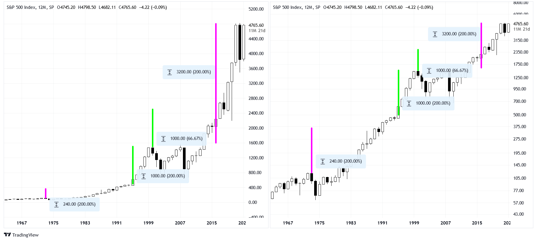
These two charts contain the same information, but with different perspectives. On the left, the scale has an even spacing of $200. We can call this the linear or absolute view. On the right, the scale is uneven when it comes to the dollar value, but it is even in a different respect! We can call this the logarithmic or relative view.
To further explain what it means to have a logarithmic view, turn your attention to the pairs of green and pink “measuring sticks.” There are two different kinds of “length” (value) that these bars have. The green bars both have a length of $1000, but their relative lengths differ. The pink bars both have a length of +200%, but their absolute lengths differ. Notice that on the left chart, the green bars are equal in length but the pink bars are not. Conversely, on the right chart, the pink bars are equal in length but the green bars are not. This is because the left chart is measuring change in the actual dollar value but the right chart is measuring change in the relative dollar value.
Another way to think of the discrepancy is by using arithmetic. To get from the bottom to the top of the green bar, we have to add $1000. To get from the bottom to the top of the pink bar, we have to multiply the bottom price by 3 (a ratio of 3x is equal to +200% relative change). On the left chart, we can shift a “measuring stick” around and the difference will be constant. On the right chart, we can shift a “measuring stick” around and the ratio will be constant.
Finally, take note of the black and white yearly candles themselves. On which view is it easier to draw a straight line through the data? The logarithmic view! Price trends are easier to see on logarithmic charts because they linearize exponential data.
So why is the price data exponential?
The Power of Exponential Growth
Investing is predicated upon compounding returns over time.
If you have $100 today and expect to earn 5% from an investment annually, you would have $105 at the end of the year. Simple enough. The next year you get 5% again, but the result is $110.25 this time. Where did that extra quarter come from? When returns have compound interest, the interest is recacluated for every investment period (every year in this example). This recalculation allows for the investment to return more each year than the year before, unlike simple interest (interest is constant from the start).
What if we wanted to calculate investment returns over 40 years, the length of a typical career? We can take our original $100 and multiply it by 1.05 (a ratio of 1.05x is equal to +5% relative change) raised to the 40th power.
After 40 years, we can expect our original $100 investment to turn into $704. Remember that if we have an comparable inflation rate during the same period, we are flat from a relative or “real” return perspective. At the very least, we preserve our wealth by investing.
Logarithms
We can use log math to find an alternative solution for the problem above. It is possible to use any base for the log function so long as the base is the same for the inverse; I will be using Euler's number as my base (the natural logarithm).
First, we take the natural log of 1.05 and multiply it by 40 (multiplication on the log scale is equivalent to exponentiation on the linear scale). Then, we take the inverse log of the product and multiply that by our original $100.
Seems a lot more complicated, why would we want to do it this way? For starters, we can find doubling times with ease. How long would it take to double an investment at a 5% annual return? We can divide the log of 2 by the log of 1.05.
About 14 years to double our investment, that really was easy!
What else can we do with logarithmic math? For those quantitatively inclined, we can linearize relative change by using log change instead of percentage change. That may sound like a bunch of nonsense, but I assure you, this concept revolutionized my analysis and how I create indicators.
Bels and Nepers
Most people know what a decibel is (dB) in reference to loudness, but did you know the bel is a general unit? It is defined as ten times a base-10 logarithm and is named after Alexander Graham Bell. If we use natural logarithms instead, the units used are called log points or nepers, named after the man who invesnted logarithms in the early 1600s, John Napier. I use centinepers (cNp) for many of my indicators because of their useful qualities.
Below is a monthly line chart of AAPL from 1998 to 2007 with 12 month relative change indicators on the bottom (log scaled). The black indicator is the relative percentage change and the red indicator is log change.
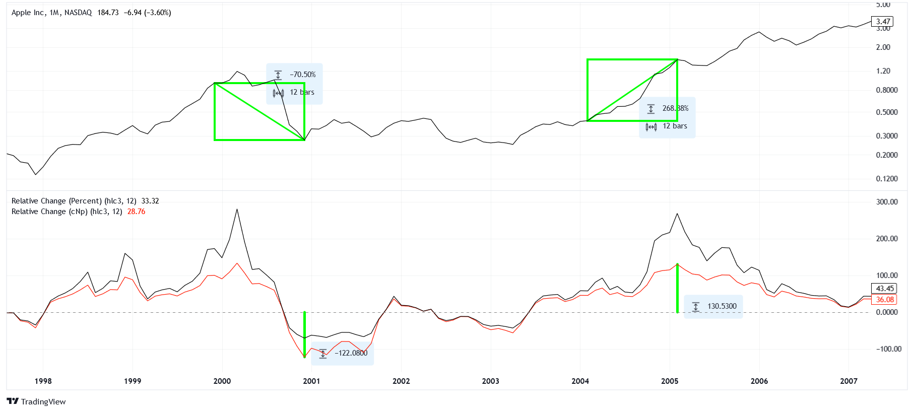
Notice that the relative percent change indicator deviates from zero more extremely than the log change indicator. This is because it is “easier” to have larger values than smaller ones. For example, if we have a year with -50% returns followed by +50% returns from a principal of $100, we would end up with $75. It actually takes a +200% gain to balance a -50% loss.
When it comes to log change, a -50% loss is equal to -69.3 cNp and a +200% gain is equal to +69.3 cNp. Log changes ensure that the magnitudes of relative losses and gains are equal. This is important for analysis as it brings the return data much closer to a normal distribution (though the actual distribution is more complex). Another big plus is that instead of having to calculate a cumulative product of ratios to get back to non-transformed data, we can calculate a cumulative sum of log changes, which many programming languages handle better.
Finally, take a look at the green markings on the chart. On the top, we have two similarly-sized rectangles. One is measuring a -70% loss and the other measuring a +270% gain. Combined, these returns would result in an 11% overall gain, but they offset each other decently well. What is important is that our log change indicator gives us equal-sized deviations that correspond to equal-sized changes on the logarithmic chart. I may study this more formally this in a later article.
A Curious Finding
Are some numbers special?
Not to flash my nerd card too brazenly, but I have been thinking about φ (the golden ratio) and e (Euler's number) a lot recently. I believe that Euler's number can be found in the market. Let me explain.
There are three levels of the SPX that are historic and related through Euler’s number. The close of $31.86 on September 16, 1929, the intraday low of $666.79 on March 6, 2009, and the intraday high of $4818.62 on January 4, 2022. These levels denote the heights of the Roaring Twenties, the lows of the Great Recession, and the ceiling we've been flirting with for the past couple of years, respectively.
From the midpoint of $666.79, we can get to the other prices using powers of Euler's number. As an approximation, you can use 2.71828 for e. First, we derive the 1929 high by dividing the 2009 low by e three times.
Next, we derive the 2021 high by multiplying the 2009 low by e twice.
As a graphical representation, here is a ladder of levels constructed from an anchor of $666.79 and ratio of e.
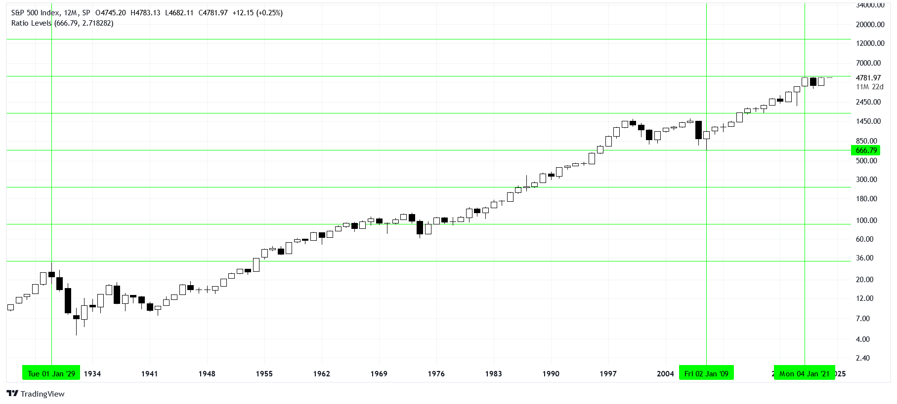
Are these predictions precise? Certainly not. They carry relative errors of +4.5% and +2.5%. Nonetheless, given the scales involved and the simplicity of the method, the results are remarkable.
Notice that the other levels in the ladder are not ceilings or floors but can serve as pivots. Many people disregard levels because they cannot predict exact support and resistance, but they can still serve as important points of interaction. As a prediction, this method suggests $13392.84 will be near an interesting level.
Wrapping Up
Markets can be measured similarly to natural systems. We use logarithms to transform exponentially growing price data to make the patterns of relative change clear to us. Some constants, like Euler's number, are embedded in logarithmic functions and can show us how points in the market relate to one another. Even though log math can be tricky, it is worth brushing up on for serious investors!
If at first this information seems overly dense, just give it some time and practice. Even though it takes plenty of studying, I guess you could say charts comes to me... naturally. 😏