

Soup's On
A delicious inflation indicator.

In this week’s article, we price the market in cans of tomato soup.
Inspiration
I have always loved looking at a particular chart that makes the rounds on the internet from the Political Calculations blog which shows the price of Campbell’s condensed tomato soup from 1898 to today. I encourage you to look at the chart on the blog itself, and that’s because I don’t want to reproduce it here without permission.
Unfortunately, the author doesn’t offer a data table of the raw data. No matter, the data is on the chart itself! With a little computer magic, we can extract the series.
Simmer Down
Looking at the series by itself, we get a chart that looks like the following.
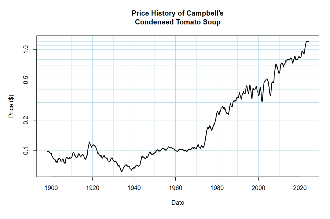
Notice the “hockey-stick” bend around the mid-1970s?
Before this point in time, tomato soup pricing was relatively stable, hovering around 10¢ a can from 1898 to about 1973 (generally, you can see depressed pricing in the mid-1930s). From the mid-1970s to about 1990, price skyrockets from 10¢ to about 40¢. The 1990s into the mid-2000s saw volatility, but not much of a price change. From the mid-2000s to today, tomato soup can prices rise from about 40¢ to over $1.20.
Goldbugs would love to point out that Nixon ended the requirement that dollars be backed by gold in 1971, and they have a point.
The country was facing financial troubles from its involvement in Vietnam, and was basically bankrupt. To counteract this, we had to fake it with money printing. That money printing was hidden because of how the petrodollar system works (besides exceptions like the OPEC oil embargo in 1973), but it could not be pinned to gold because the public would find out how the debt would be serviced. “How,” you ask? Ultimately, inflation. The debt would not be worth as much if the strength of the dollar that the debt was denominated in plummeted!
Reeling back from my armchair understanding of economic history, I think the soup data is important because it’s telling us something about inflation that the dollar isn’t.
Too Many Cooks
Despite the previous section indicating my desire to understand the history of inflation… I really just wanted to price the S&P 500 index (SPX) in cans of soup.
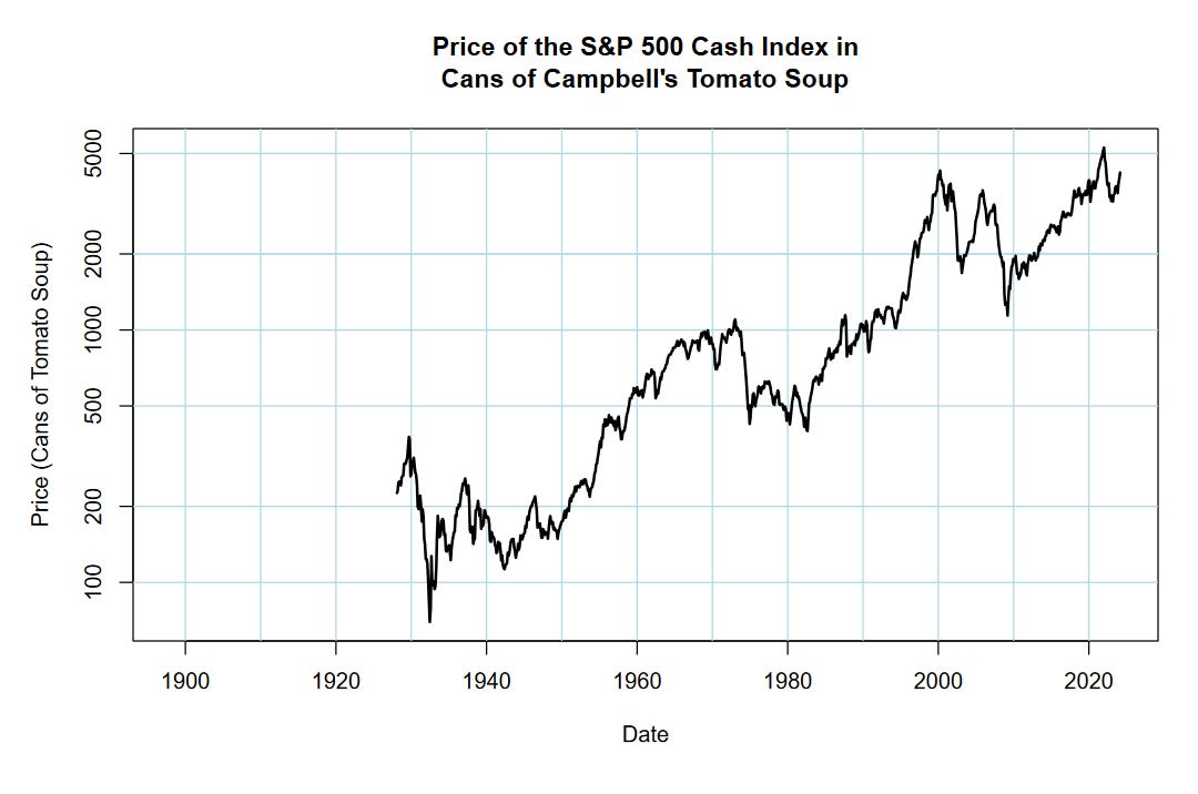
Some things to take note of. Notice how we’re dealing with breaking out to new all-time highs that were set by the Dotcom bubble. This period echos back to 1987, which attempted to break past the highs set in 1972, and 1956, which attempted to break past the highs set in 1929. One reason why our current market is split-minded on how to interpret its valuation and technical strength is because we are at a gigantic inflection.
What do I mean by this?
Take a look at the chart again. Draw a line between the highs of 1929 and the lows of 1982. Do this again between the highs of 1972 and the lows of 2009. In between these time points, we have markets that rally up to new highs, only to drop down to the levels placed by the previous mega-cycle rallies.
Could this be the case once more? Another mega-cycle rally going into 2030, the SPX raging beyond the $10000 level, only to get cut in half again down the line?
It’s certainly something I could envision happening, but that’s with a purely technical understanding of history. When you take the fundamental situation into account, it’s less likely given how levered financial markets already are.
Future Soup
I dearly want to find a series of the American equity market that goes back further than the late 1920s. I know that TradingView has a series on the Dow Jones Industrial Average that does this, but so far have not tried to scrape the plot for its data.
If you have any ideas of what the price history of soup could mean, or how to analyze it better next time, I’m all ears! Shoot me an email.