

Bézier Regression
Are you into curvy models?

In this week’s article, we explore an experimental regression method.
Refresher
In order to not retread old ground, you might want to take a look at my previous post “Nonlinear Regression” for an overview of the methods used in this article.

We will be fitting our Bézier regression model in a similar fashion, using an optimizer to minimize the sum of squared residuals between the model’s predictions and the original data. If that sounds confusing, please read the previous article!
Bézier Curves
Bézier is the last name of a smart Frenchman and is pronounced “BEZ-E-AY.”
The method of drawing curves that Bézier created allows for smooth interpolations between a series of control points. Zone out on this animation from Wikipedia for a minute and see if it “clicks” with you.
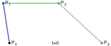
Looks pretty, doesn’t it?
Think of the “base layer” as the labeled control points, of which we have four. The next “layer” is the green points. As our t variable moves from 0 to 1, each green point progresses from one control point to another. There are three of these moving points: one that moves from P₀ to P₁, one from P₁ to P₂, and one from P₂ to P₃. We’ve now reduced the four original points into three new points.
This process is repeated until the series is fully reduced to a single moving point. Notice that the blue points are the reduction of the green points, and the black point which draws the red curve is the reduction of the blue points.
Ultimately, four control points are reduced into a single smooth curve. Nice!
Getting Technical
Without getting bogged down in the details, this is R code that reduces a list of points into a function that can be called on to produce the point of the Bézier curve at time t.
bezier_evaluation <- function(pts) {
    function(t) {
        lst <- as.list(pts)
        while (length(lst) > 1) {
            for (i in 1:(length(lst) - 1)) {
                lst[[i]] <- (lst[[i + 1]] * t) + (lst[[i]] * (1 - t))
            }
            lst[[length(lst)]] <- NULL
        }
        lst[[1]]
    }
}
I could ramble about how cool this function is, but we can just use it instead.
xy <- c(0+0i, 1+3i, 2+1i, 3+2i, 4+1.5i, 3+1i)
f <- bezier_evaluation(xy)

t <- seq(0, 1, length.out = 100)
curve <- f(t)

plot(xy)
lines(curve)
We first create a vector of complex numbers that we’re calling xy. We then enclose a function called f that will evaluate a Bézier curve over these control points. Our t values will always be bounded between 0 and 1, so we sequence 100 values between these bounds. Finally, we can evaluate the curve using our function f on the t vector.
Plotting both the control points and curve looks like the following.
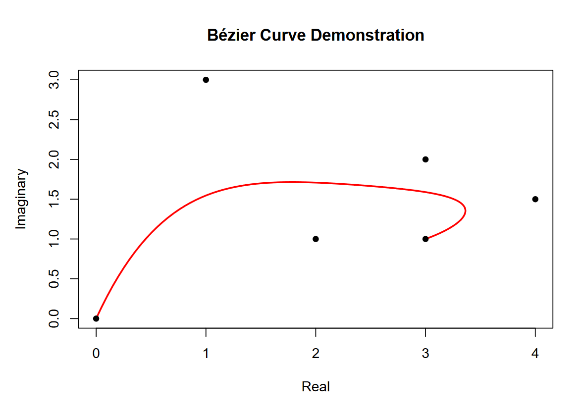
Never mind the X and Y axes being labeled “Real” and “Imaginary.” I did that to stress that we’re using complex numbers to make working with X and Y points easier. Something that should be more obvious in the plot is that the order of the points does matter. The curve begins on the first point and ends on the last, but the influence of the middle points on the curve changes as t progresses from 0 to 1.
The Main Attraction
Let’s start with the model output and work backwards. We’ll be using the S&P 500 cash index (SPX) as we always do.
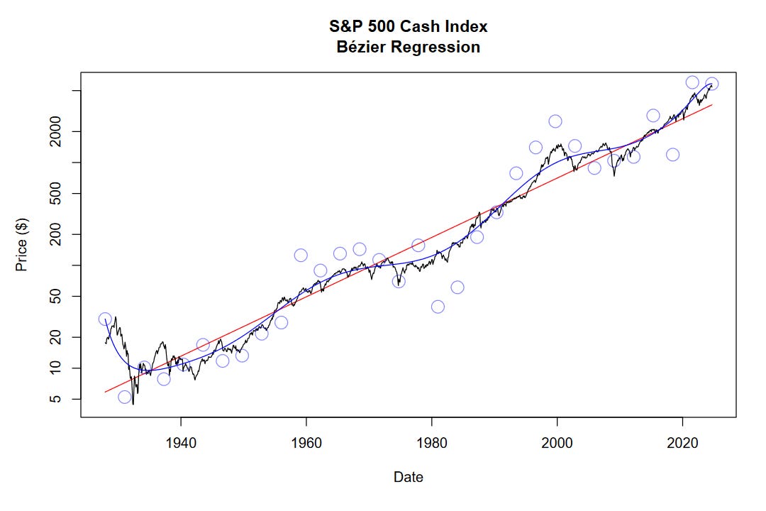
Briefly, let’s discuss how it’s made.
First, we fit a log-linear regression on the data, shown in red. Next, we set up our control points along this regression line, spaced at equal distances from one another. While optimizing the curve, we let the Y-axis component of the control points move freely but anchor the X-axis component. As the X axis moves from 1927 to 2024, our variable t is moving from 0 to 1. We can run the optimizer a few times on iteratively updated control points, depending on how tight we want the fit to be.
The final control point positions are shown by faint blue circles. The final Bézier regression curve is shown in blue. On a logarithmic scale, we are able to reduce the sum of squared errors to 39.9 using Bézier regression, down from 157.2 using log-linear regression.
It’s crucial to note that the control points at the very start and end of the curve have a lot of influence and overfit those periods. Because of this, we should take the model outputs near 1927 and 2024 less seriously than the outputs near the middle.
Market Cycles
In the same fashion as the previous post on “Nonlinear Regression,” we can determine long-term market cycles using our model. To do this, we take the quotient between the Bézier regression (blue curve) and the log-linear regression (red line).
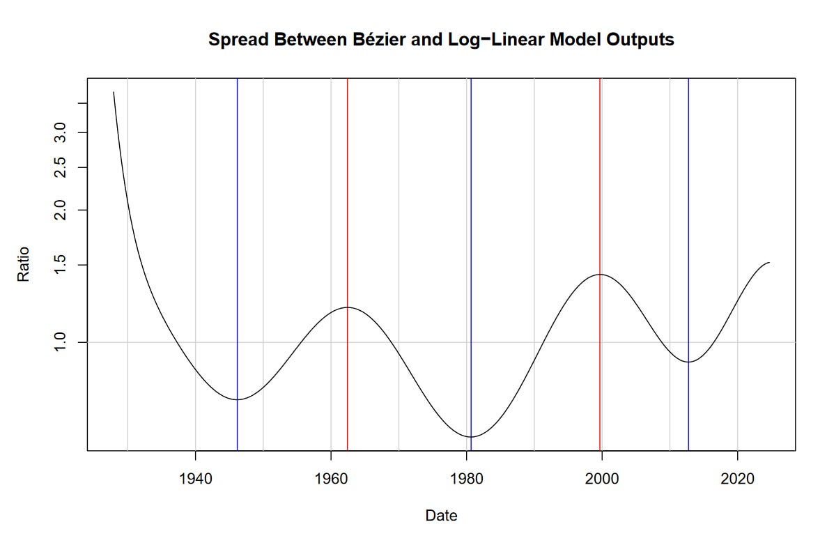
If you look at the previous post, you’ll notice that the peaks and troughs highlighted by these methods have a fair degree of correspondence. Lows include the mid 1940s, early 1980s, and the mid 2010s. Highs include the 1960s and 2000.
Unlike the sine-wave model, we are unable to project the Bézier regression into the future. Nevertheless, it appears that we’re approaching another peak.
Perhaps this method allows us to be… ahead of the curve!